
How to use Price Benchmarks
The Benchmarks Tab within a Case provides pricing insights through advanced comparison tools that help users evaluate whether their insurance policies are competitively priced. This functionality leverages Advocate’s national policy data set to provide benchmark visuals and metrics.
Benchmarking Overview
The Benchmarks Tab currently supports price comparisons for single-asset policies only and includes two tools:
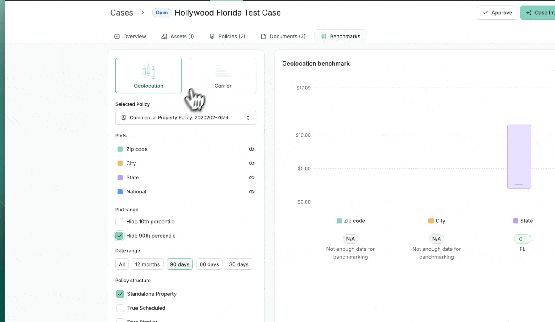
Geolocation Benchmark – Compares a policy's Rate on Line (RoL) to other similar policies based on geographic criteria.
Carrier Benchmark – Compares a policy's RoL to other similar policies grouped by insurer (Carrier).
When to Use It
The benchmarking tools are designed to support informed decision-making at key moments in the insurance review process:
After a policy review is complete
When assessing the competitiveness of a quote
To support waiver requests or push back on unexpected premium increases
How to Use It
Follow these steps to utilize the Benchmarking features effectively:
Open a Case
Navigate into any case file where a policy review has been completed.Click the Benchmark Tab
Inside the case, select the Benchmark tab to access comparison data.Review Market Comparisons
You’ll see how your policy compares to other “like-for-like” policies—filtered by geographic location and key risk factors.
Who Can Use This Feature?
Anyone with access to a case that includes a completed policy review can use the Benchmarking tools.
User Interface & Actions
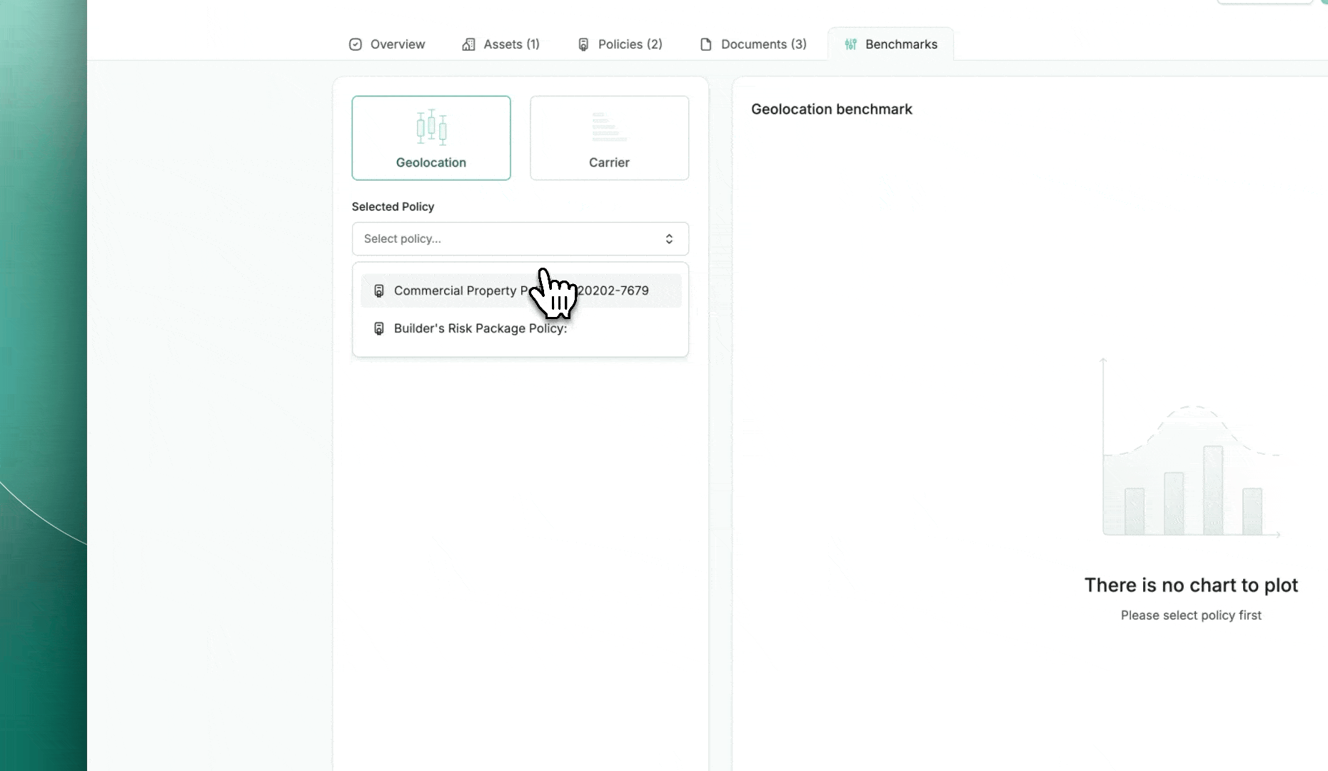
Policy Selector – Users must select a Policy from the Case to generate benchmarks.
Geolocation & Carrier Toggle – Users can switch between geolocation-based and carrier-based benchmarks.
Benchmark Chart Area – Displays box and whisker plots representing RoL distributions for different segments.
Interactive Features:
Filter by percentile range (e.g., 10/25/50/75/90).
Apply date filters for Policy Effective and Expiration Dates.
Toggle visibility of each benchmark plot (e.g., Zip Code, State, National, All Coverages).
Visualize the selected Policy’s RoL as a line overlay across benchmark plots.
Comparative Metrics:
Each benchmark chart provides delta metrics to indicate how the selected policy compares:
Delta to 75% Percentile
Delta to Median (50%)
Delta to 25% Percentile
When No Data Is Available
If the selected policy lacks sufficient comparable data, a placeholder graphic and message will appear (e.g., “There is no chart to plot”), prompting the user to select a different policy or adjust filters.